Exposure, Sharpness,
and Processing
Q. This is an exposure and processing question.
Your photographs (and a very few others) are remarkably sharp, and show a depth
of color that I have been unable to attain. Would you please share how
you expose your images, and perhaps just a bit of your post processing?
Not much too it, I expose for what I want and adjust fine color in ACR, I use
canon 1ds series cameras or H2 with a P45 back and as a back up to that I have
an aptus 75s that I really no longer use but maintain as a backup to the P45.
Not looking to spend 30,000 on a back and another 8-12,000 on a camera?
Than I feel there is only one option currently available, the Canon 1ds3, it
is a remarkable camera as was the 1ds2 before it. If the 1ds3 is a bit
pricey the 1ds2 is still around on the used market and worth it for anyone as
a main camera or back up to a digital back or 1ds3. I would say that below
that I would look into a 1dsmark1 yes the 11MP version, I still recommend that
over the 5d in general unless you will be doing mainly high iso shooting, but
for anything with controlled lighting at 200iso or less the 1ds had a definite
advantage in my mind, and today I would say for high iso performance look at
a 40D which are very inexpensive, and if you are needing to shoot high iso the
least of the image quality problems should be a lack of a full frame, since
there are enough lenses now that can handle the wide and out perform in quality
what the noise will screw up.
I do not do any capture sharpening, it does nothing but make you feel better
when viewing the image. Sharpening should be the last step and should not be
done to a master file that way you can open an unsharpened file, flatten up
size if needed to the specified file dimensions needed and sharpen specifically
for each specific output or offset press.
As for lighting here is a hint, not at all conclusive but often the issue many
have, first don't blow out everything especially skin, expose to the right is
as dumb as expose to the left, expose for what you want the end result to look
like and know the dynamic range of your camera so you can allow for slight under
and overexposed areas to create contrast and drama and keep it within the limits
of the sensor to maintain sufficient detail in the raw to maximize it later
if needed. Expose for the look and feel, if its a very light and airy
blown out skin type shot fine expose that way, if you want some deeper color
and tonality expose that way!
Next lighting in general. Again this is not at all conclusive, but ....
Well if using a softbox or umbrella or octobox, octadome, octabank, Softlighter
2, bounce off flats STOP!
If using a beauty dish, make it silver not white and grid it, if using a diamond
box, glamour box STOP!
Try a bare reflector, gridded, silver beauty dish and grids, Fresnel, focusable
spotlight, harsher rims and side lighting. That's harder.
Wait.... Let me guess if you just read anything else I answered I just said
everyone should go out and buy a softlighter 2 which is a very good low cost
alternative to an elincrom octabank that is one of the softest most wrap around
light sources available! So what the hell am I on to say this? 
Well sadly, nothing, nada, zilch, I am this screwed up in the head without the
benefits of some strange substances that alter my mind in ways that many non
control freaks find "groovy man" 
I am telling you that all sources are great to use, but the softer the source
the softer the light the softer the shadows tend to be the less the contrast
tend to be and appear and that tends to be why many have a lack of perceived
sharpness in their images, learning to control harder light will add some contrast
in and a little punch and snap, crackle and pop! than you can take
what you know and apply it to big soft lights and start to get that sparkle
using them all. But you must be in control of the light and especially
spill and unwanted bounce! I never understand why people always like to
paint a multi use photos studio white! It should be black! But that's
depressing so make it a deep gray and put one of those of lights for S.A.D.
(seasonal affective disorder) on when depressed! heres a link to buy some
( http://www.fullspectrumsolutions.com/light_therapy_13_ct.htm?sc_cid=146&s_kwcid=sad|935102296&gclid=CPb4jv_D3pECFQXwlgoduEkMfQ
) 
Keep the stray light to a minimum! You'll thank me later, or your be too
depressed to do so in which case sorry
Now some of the other answers get into good color, start with this one
Gels,
Filters and Getting Good Color! its about gels and filters and getting
good color! Plus it took a whole bunch of time to write so at least of
you say you read it it will make me less in need of a S.A.D. light
As for post production, its very, very rare that I do not add contrast, digital
cameras capture too much range and try to maintain detail all the way from white
to black, you should not always have that, black should be black! White
should be white! Why would I want 87 shades of lighter and lighter gray
and 26 shades of darker and darker gray when I should have white and black!
 So I put
it back in and add some contrast, this boosts color saturation often, use an
s-curve on an adjustment layer, its cool! now issue is an s-curve sometimes
makes things too warm and contrasty, but not too much contrast, just the yellows
went a bit much, so take the adjustment layer and turn the opacity to 50% than
duplicate it, and you are right back to too much yellow!
So I put
it back in and add some contrast, this boosts color saturation often, use an
s-curve on an adjustment layer, its cool! now issue is an s-curve sometimes
makes things too warm and contrasty, but not too much contrast, just the yellows
went a bit much, so take the adjustment layer and turn the opacity to 50% than
duplicate it, and you are right back to too much yellow!  I know, I just like making you do things
just kidding, now the point was to take the second and turn the blend mode of
that second 50% s-curve layer to luminosity and you will see a shift in
color but maintain the overall contrast. You may want to adjust these
two layers to more like 75-25% in either way or anywhere that looks good
too you, I am not there so I would be of little help in telling you what that
would be
I know, I just like making you do things
just kidding, now the point was to take the second and turn the blend mode of
that second 50% s-curve layer to luminosity and you will see a shift in
color but maintain the overall contrast. You may want to adjust these
two layers to more like 75-25% in either way or anywhere that looks good
too you, I am not there so I would be of little help in telling you what that
would be
I rarely ever use a boost in saturation and if I do its not on skin but on other
areas, but very often use curve adjustment layers, and because I like
all you I will let you have some I put online a long time ago, they have some
screwy names, and some that actually make sense. Ignore the names, I am
not renaming them all have been used to these names since 2001 I think, I am
not looking to learn a new name for an old curve! I will say that the
skin one that is beyond best and has been duplicated (supposedly) by many companies
and added into plug ins for skin (never use plug ins so I don't know if they
did a good job or not) is warmer not warm, to warmtwo not cool,
but warmer! its cool in a warm sort of way
the link to find them is here http://nyphotographics.com/ftppage.htm
scroll around till you find curves.
Here are a few samples from a 1ds3 full size jpgs
http://stepheneastwood.com/Canon/Files/
I personally like these
http://stepheneastwood.com/Canon/Files/1__16H0049warm.jpg
http://stepheneastwood.com/Canon/Files/1__L0I0248full.jpg
Some large 1ds3 files you can check I suggest you blow them up in steps, nothing
fancy 110% up to say 60x90inch at 300 and print some crops and see how it looks.
Plenty of detail that we would have to remove before reskin texturizing.
Here are some 1ds2 images, most of these I think were taken with a 35-350 L
lens.
Right click and save as
http://plasticmagonline.com/forftpdown/ManyMore/1_VR2D5158cd.jpg
http://plasticmagonline.com/forftpdown/ManyMore/costco-277copy.jpg
http://plasticmagonline.com/forftpdown/ManyMore/1_VR2D1573cleanem.jpg
http://plasticmagonline.com/forftpdown/ManyMore/1_VR2D6290.jpg
http://plasticmagonline.com/forftpdown/ManyMore/1_VR2D5043.jpg
http://plasticmagonline.com/forftpdown/ManyMore/1_VR2D5752contrast.jpg
http://plasticmagonline.com/forftpdown/ManyMore/costco-277copy.jpg
http://plasticmagonline.com/forftpdown/ManyMore/costco2_0144.jpg
Here are a few raw 1ds2 files, you can see in acr what they look like and the
acr setting I used this will be backward compatible to Photoshop CS2
the xmp file is included in each zip take both or it has no value looking since
those settings are the starting point out of the camera.
These are out of the camera raw, the adjustment from raw is included for acr
open them and open them in Photoshop to see what they would look like coming
into Photoshop to start
http://plasticmagonline.com/1_35-350.zip
http://plasticmagonline.com/2_35-350.zip
http://plasticmagonline.com/3_35-350.zip
http://plasticmagonline.com/4_35-350.zip
http://plasticmagonline.com/5_35-350.zip
http://plasticmagonline.com/6_35-350.zip
http://plasticmagonline.com/7_35-350.zip
http://plasticmagonline.com/8_35-350.zip
http://plasticmagonline.com/10_35-350.zip
1DS3 and G9 Files fullsize to compare, view
them here. http://stepheneastwood.com/Canon/G9_Samples2/
My typical files have many layers sometimes 10 sometimes 115 and most
are adjustment layers of some sort and all have masks to be selective
I am quirky like that
The final thought I have here is this. Learn to see! I can't
tell you how many calls, emails and letters I get from people who say I cannot
get good skin color, they go on to say I love the skin tone you get, which leads
me to conclude 1. they are relatively intelligent, and 2. they are not
color blind!
that said they are still getting bland, horrible lackluster skin! I only
want to know what are they looking at on the screen when making adjustments
and why do they stop adjusting when the color looks bad to them and call it
done? Most do not have a color fairy coming at night and going through
their files and correcting things for them, I know mine told me she does not
visit many others around this planet
And incase you missed it, here are a few examples (meant to be a bit warm toned)
that many have said is nice skin color and they were from a little G9 point
and shoot (converted from raw)
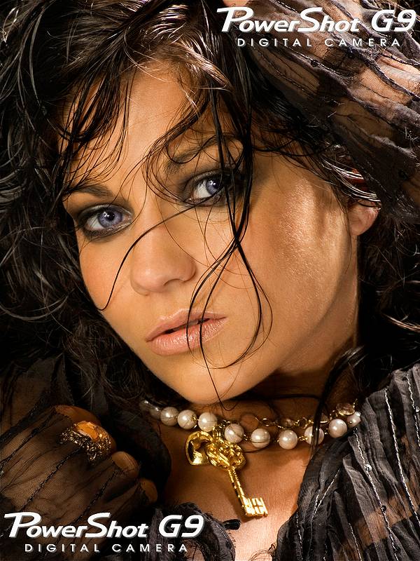
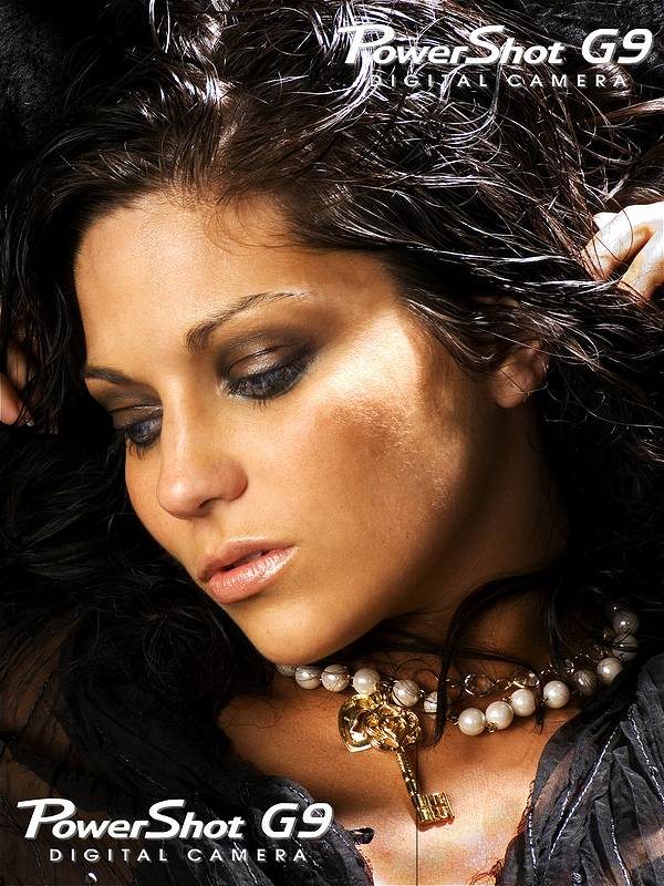
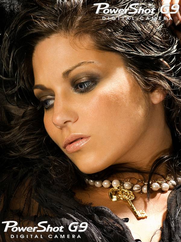
Here is the thread with links to fullsize versions of them http://www.modelmayhem.com/p.php?thread_id=249588
And I will say that it was very little work to get the skin color, in fact it
may have been easier to adjust than many higher end dslr's and digital backs,
since the lack of dynamic range and tendency toward contrast makes the shot
more contrasty to start! And thats a POINT AND SHOOT CAMERA!
So shoot and look at the file and do not stop until the skin looks good to you!
Unless you are lucky enough to find a color fairy of your own, mine is
purple
Now as for the Point and shoot camera, do I recommend one to someone who needs
a back up or cannot afford a dslr at this point? Well the G9 by canon I have
this to say. here is what I tell people who are asking, for the price it has
advantages and disadvantages over a rebel xti, the advantage is you can and
likely will carry it everywhere, its the size of a pack of cigarettes, enough
people carried those and still do for years so its very possible, it fits in
a pocket (although more bulky than a digital elf) and has a nice strap. A rebel
is still just too big to carry everywhere, when you go out to a party you do
not want the camera/lens hanging around your neck making you look like a tourist,
the G9 hides away, big difference, having it when and where you are vs saying
WOW, I wish I had my camera.
Now the downside, the rebel is a much larger sensor, not that much more with
kit lens, although the lens on the G9 equals about a 35-210mm, so a rebel with
that equivalent gets more expensive and larger. The G9 is really best at 80-100
iso, which is low but with light its not that bad, and the reality is you are
often shooting at f 2.8-5.6 at most, so its often more light than you need.
It does go higher and up to 400 is OK, 800 a bit noisy from a dslr perspective,
but no worse than actual 35mm film grain was, and 1600 is a use only if needed,
but when its needed its there and if its going B&W its very, very nice grain
look. The screen is great! the colors are great, the raw provides a real 3/4
to 1 stop latitude in both plus nd minus, more in an underexposure but it gets
noisy, and not that forgiving of more than a stop over (blown highlights) so
care is needed more than with the larger chips. The jpgs are very nice out of
the camera but the raws in 16 bit shine!
If you can live with those limitations, its a killer camera and can be very
useful as a back up, and lets face it, when you are running on a back up, its
better to have some limitations than just pack up and go home empty handed.
here is another shot i took, the first with a G9 the second with the 1ds3 for
a book on beauty photography for digital, lighting, to retouching.


And here is a link to some full size shots from the 1ds3 and G9, to check as
well. http://stepheneastwood.com/Canon/G9_Samples2/index.htm
©Stephen Eastwood 2008 www.StephenEastwood.com
www.StephenEastwood.com/bio
www.StephenEastwood.com/tutorials